Designing the authorized user experience Chase was missing
Projected impact: Approximately $440 million in net present value over five years. Authorized users increase account spend by a blended 3%, with 10% of AUs driving 30% incremental spending growth by Year 5.
Overview
MultiCard 2.0 set out to solve two interlocking problems at once: giving primary cardholders real control over the authorized users on their account, and giving authorized users, historically an afterthought, trapped behind a primary's login, an experience of their own for the first time.
My role
Design lead
Lead reseracher
Content editor
Our team
5 Product Managers
2 Engineers
1 Design Lead
Timeline
October 2024 -
May 2026
What is an authorized user
An authorized user is a secondary cardholder added to an existing account by the primary account owner. They might be a spouse sharing household finances, a nanny or personal assistant managing family expenses, a teenager learning about money, or an employee with access to company spending.
The challenge
Today, authorized users cannot log into Chase. They can only receive a card and spend freely. This experience is severely limited compared to competitors.
Meanwhile, primary cardholders can add authorized users, but lack any real tools to manage them. This creates a bottleneck: high call volumes, frustrated customers, and no scalable solution.
The result is friction across the board. Families can't easily manage shared finances and Chase's call centers are drowning in preventable requests.
By reimagining the authorized user experience, we unlock a new revenue stream, reduce operational burden, and give customers the tools they've been asking for.
Research & Discovery
Our approach began with quantitative research conducted by the previous MultiCard team in 2024. They surveyed hundreds of cardholders and authorized users to uncover their needs, pain points, and desired features
Key findings:
Primary cardholders wanted granular control: ability to set spending limits, pause cards, and monitor activity
Authorized users wanted digital independence: direct access to their activity without relying on the primary cardholder
Most competitors offered tiered access levels that Chase lacked entirely
With this research in hand, we conducted two collaborative workshops with the full product and design quad:
Workshop 1: Defining Tiers
We mapped out the different types of authorized users and defined what capabilities each tier should have. This framework would guide all downstream design decisions.
Workshop 2: Feature prioritization
Using the foundational research and tier structure, we prioritized which features and capabilities to include in scope. This forced us to make hard decisions about MVP vs. future roadmap items.
Organizing the scope
The project spans three interconnected areas:
Digital access enablement: Building the core infrastructure that allows authorized users to digitally access and manage the card. This includes authentication, card activation, and linking to their own digital wallet.
Primary cardholder management: A new hub where primary cardholders can add AUs, set tier-based permissions, configure spending limits, pause cards, and monitor activity in real time.
Authorized user experience: A simplified card experience for AUs: their own dashboard, activity view, limit visibility, and ability to manage their own digital wallet access.
We decided to start with designs for primary cardholder management. It was the most pragmatic entry point: building within an existing experience meant faster iteration and lower technical risk compared to the entirely new digital access enablement work stream.
Guiding Principles
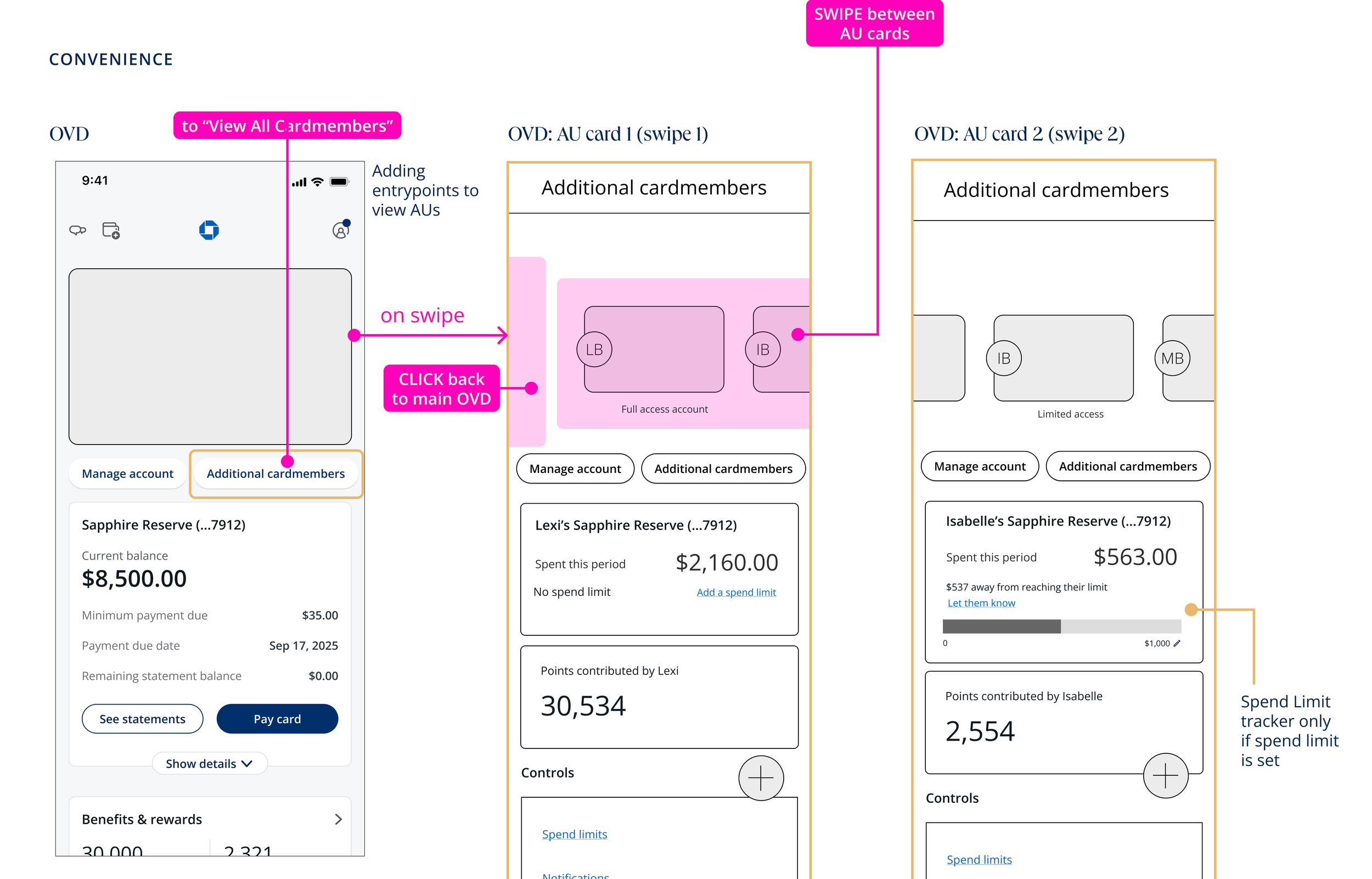
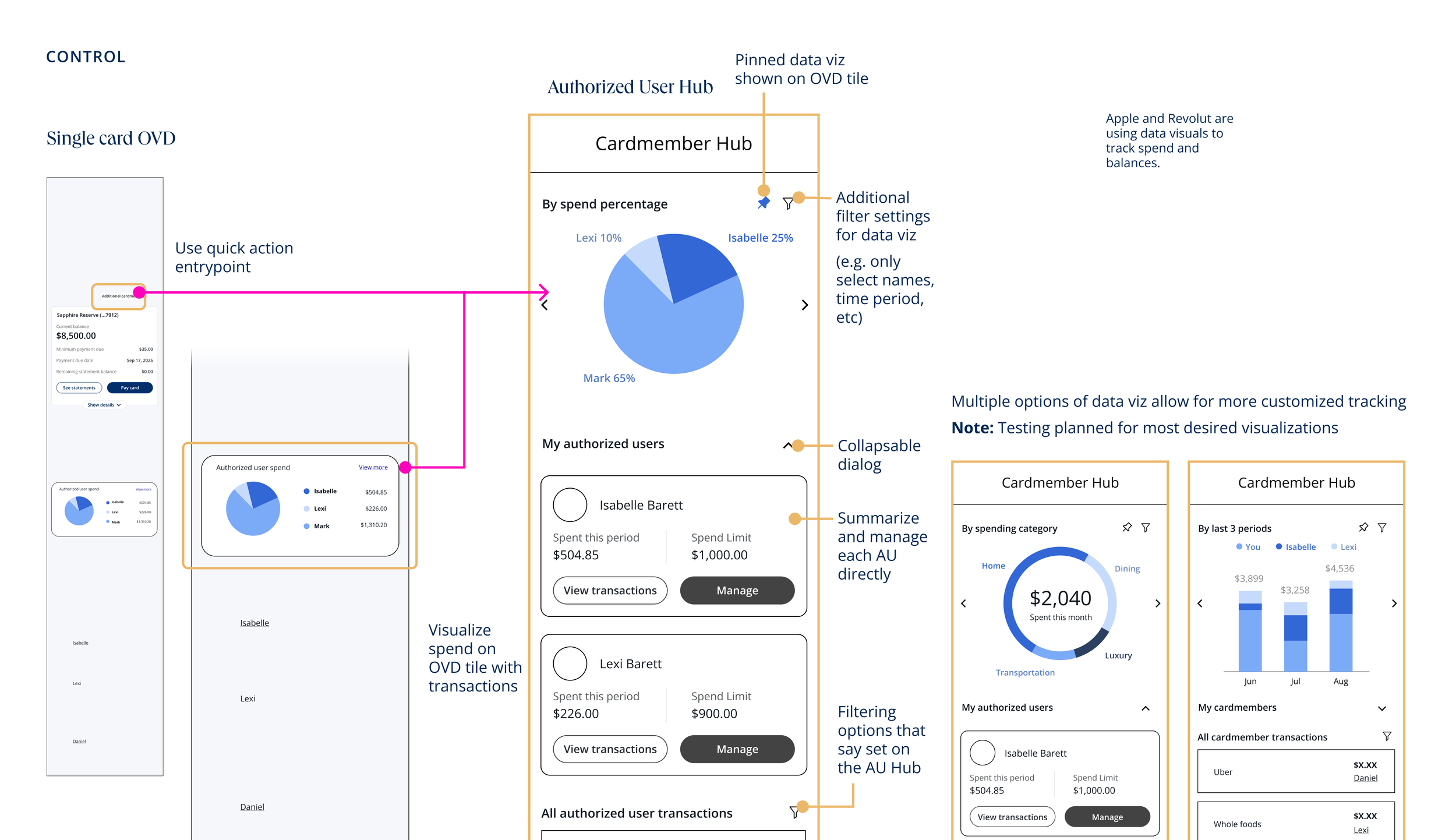
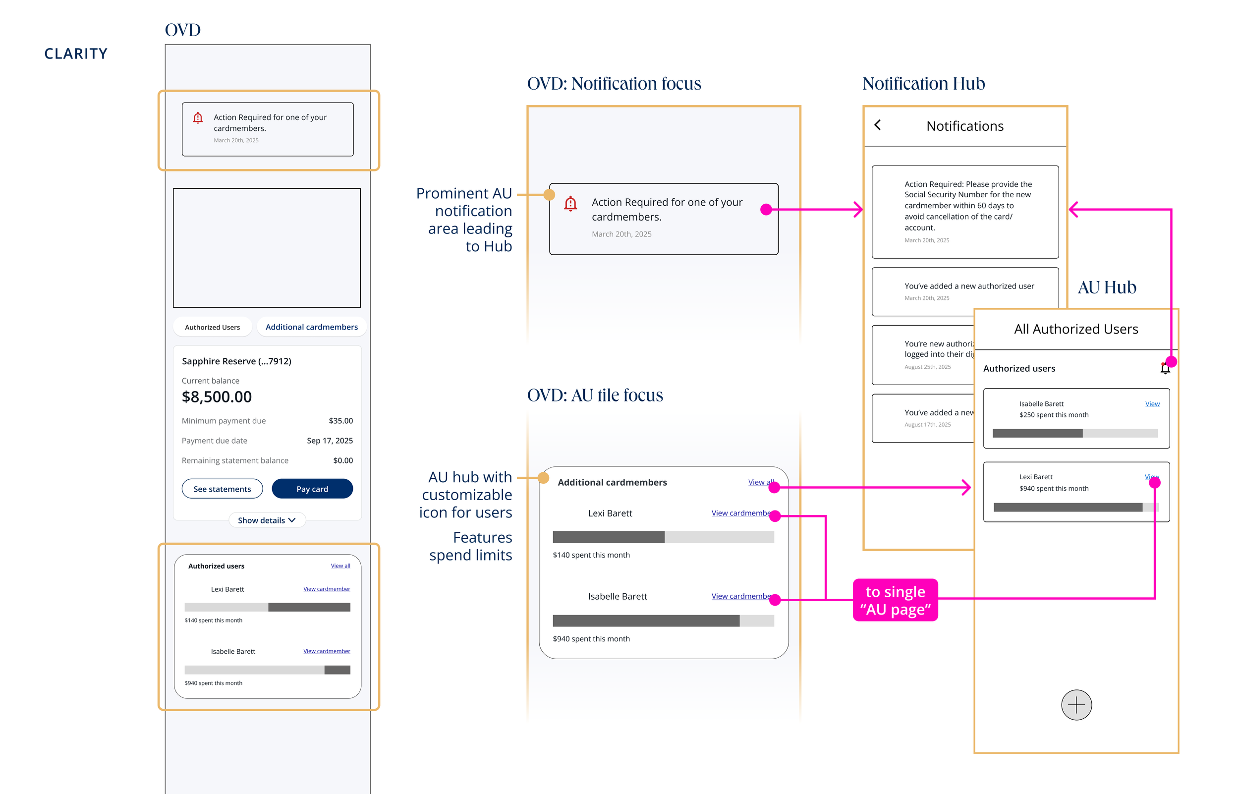
Rather than start with wireframes, we distilled our approach to three core words: Clarity, Control, and Convenience.We took each principle to its extreme.
What users told us
Convenience: "Was cool, just needs some usability tweaks." The vibe was right, but swiping felt too playful for something as serious as financial management.
Clarity: "Was easy but boring and too long." Users found it straightforward, but it felt hollow. Clarity without depth left them wanting more control.
Control: "Was also easy and had some cool features but needs some usability tweaks." Users appreciated the depth. Control resonated.
Summary: Users didn't want to trade power for simplicity. They wanted both. This validated our direction: we couldn't sacrifice depth for ease, nor control for convenience. We needed to design an experience that could hold all three in balance.
How our designs have influenced Chase home-page as we know it
Because Multicard touches nearly every surface of the app, that one interaction choice rippled outward, raising flags across connected teams who hadn't planned around it.
We refined the swipe prototype with the usability lessons from testing and ran it head-to-head against a tile-based fallback with 40 participants. Asked how the new experience compared to how they manage authorized users today, most rated it slightly or much better & enough signal to keep swipe alive, even as internal debate continued.
The question that wouldn't go away: if swipe worked so well for authorized users, should it live at the account level instead? We partnered with the Channels team on a broader study testing swipe across multiple entry points (all accounts, credit cards only, bank accounts only, and mixed levels) with Channels running the research and design consulting on the AU-specific implications.
The winning structure: swipe at the top level between primary cards, and we use our backup option with a dashboard for authorized users.
Outcome & impact
Current status: Rollout is underway, sequenced around the Apple Card acquisition timeline. Spend limits for authorized users matching Apple Card parity shipped first, with designs delivered in April 2026 and general availability targeted for September 2026.
The primary cardholder dashboard followed in March 2026, giving primaries visibility into total AU spend and transactions filterable by authorized user, and serving as the entry point for management features like editing contact info, changing access level, and resending invitations.
This project has been one of the most complex initiatives I've led at Chase. It required tight collaboration across product, design, engineering, and legal. The scope spans three separate user personas with competing needs, and the technical requirements are significant (authentication, card linking, real-time data sync). Because Multicard's footprint touches nearly every team in the Chase app, our team shifted from building every screen ourselves to consulting across teams as they implemented the designs within their own surfaces.
What I'm most proud of is how we kept our principles front and center. Even as scope shifted, PM and design leads transitioned, and constraints emerged, the commitment to clarity, control, and convenience guided our decisions — and the instinct to test extremes rather than settle early paid off at every stage.
This positions Chase to establish digital-first family finance capabilities, reduce operational burden on call centers, and unlock a new revenue stream by shifting power to customers themselves.